Products · Powered by slideAcross
dataLayers
Where presentations meet dashboards. The polish of a branded presentation, the freedom of a live dashboard, and the story written for you. Present the headline, then drill into any region, team, client or class, without leaving the presentation.
Built for COOs, operations directors and data leads.
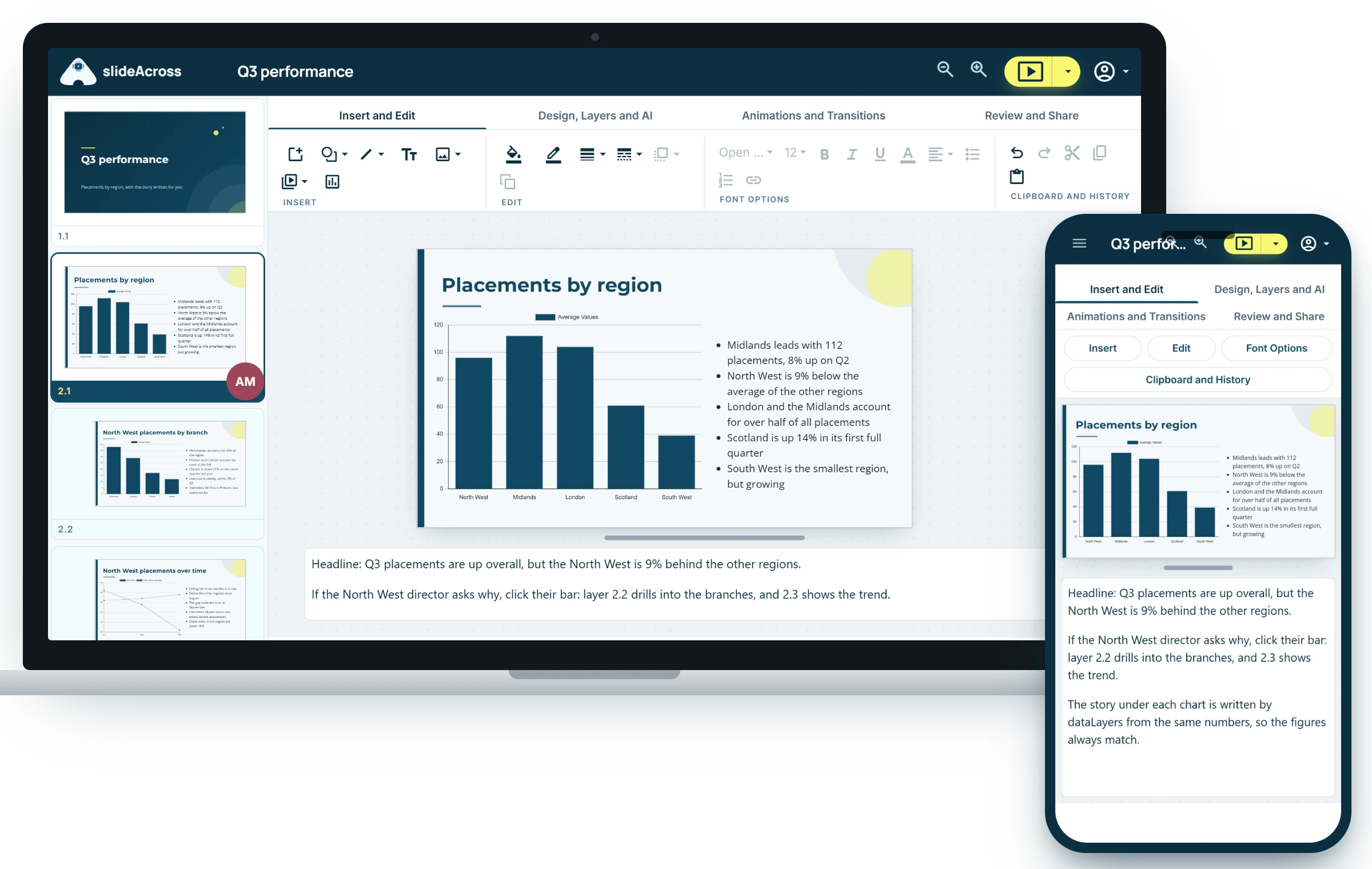
See it in action
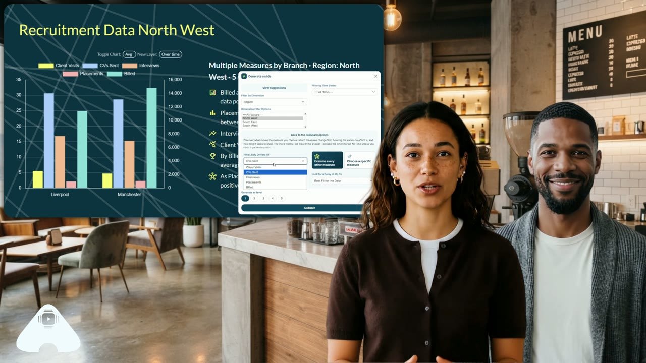
Introducing dataLayers
A short walkthrough with commentary: bringing your data in, the story written for every chart, and drilling into the detail without leaving the presentation.
The best of both worlds
Until now, you had to choose
A presentation tells one story, beautifully, but someone rebuilds it every month, and every "what about my region?" becomes a follow-up after the meeting. A dashboard answers everyone's questions, but tells no story at all. Data-driven meetings need both.
Presentations
Branded, fixed and rehearsed.
- Your brand and your narrative
- Approved content, ready to present
- Rehearsed, polished and in control
But it's one version for everyone, with no answer to "what about my team?"
Dashboards
Flexible, drillable and personal.
- Drill into any number
- Filtered to my data and my region
- Always up to date
But there's no story, no brand, and everyone's numbers depend on when they last refreshed.
slideAcross with dataLayers
Both, in one presentation.
- The headline message, branded and rehearsed
- The story written for you, at every level
- Every region's own numbers, one click beneath it
- A fresh pack when new data arrives, fixed so everyone sees the same numbers
The story keeps layering
Every drill writes the next chapter
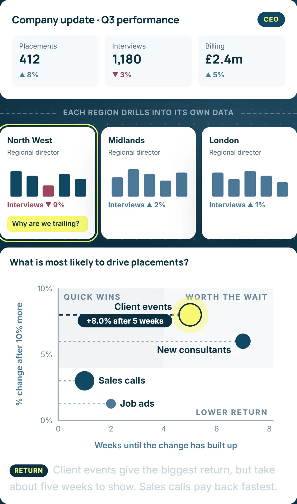
A dashboard gives you another chart. dataLayers gives you another chart and the story that goes with it: what changed, how it compares, the trend, and the measures that move together.
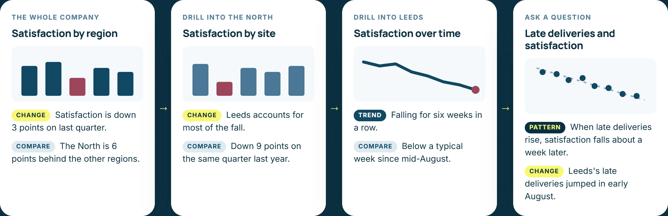
The story doesn't stop at the headline. It starts there. Summaries come from a built-in language engine (the same numbers in, the same words out, never an invented figure) or your organisation's chosen AI.
The correlation engine
Invest where it really pays back
Every organisation runs on inputs and outputs: calls and new business, marketing and enquiries, new starters and delivery. But before a sales day or a new hire, can you prove which input drives which output?
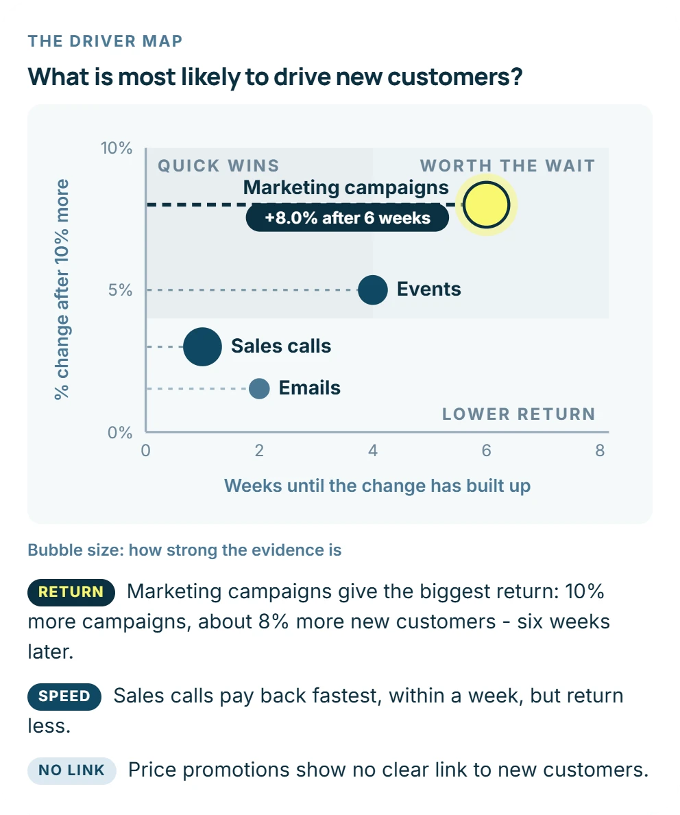
Ask "what is most likely to drive sales?" and dataLayers tests every input you hold, then plots them on one chart:
- Which: the inputs your results really follow, and the ones that only seem to
- How much: the return for every 10% more of each input
- How soon: whether results show the same week, or two months later
Only strong, statistically tested links are flagged. Seasons and working days are allowed for, and you're told when there's too little data for a firm answer.
One version of the truth
Everyone scrutinises the same numbers
A dashboard shows whatever the data said when it last refreshed, so two people in the same meeting can be looking at different figures. A dataLayers pack is fixed at the moment it was made.
Fixed at a moment in time
Every pack keeps the numbers it was built with, and when. Drill as deep as you like: the figures don't shift while you're discussing them.
Shared scrutiny
The board, the directors and their teams all question the same figures, so the meeting is spent on decisions, not on whose numbers are right.
Fresh when you choose
When new data arrives, a new pack is built and sent. Last quarter's still says what it said.
How it works
Slides you can question
Bring your data in
Upload Excel or CSV, every tab read. Or connect a live Google Sheet, an Excel file in OneDrive or SharePoint, or a file at a web address.
It understands your data
Dates, measures, categories and IDs are recognised for you, and new uploads merge in so history builds up.
The story, written for you
Every chart comes with a plain-English summary, compared with the average, other areas and earlier periods.
Packs that rebuild themselves
Make any deck a template. When the data refreshes, every chart and story is rebuilt and sent to the people you choose.
Drill as you present
Click a bar and a region becomes that region over time. Your audience sees a clean chart; you see the controls.
Just say it
"Drill down into London", "show this over time", "find what drives sales": explore by voice.
Governance
Control who sees what
Built on your organisation's departments and teams, so the CEO sees the whole picture and each regional director sees their own, and no more.
- Permissions by department: full access, own rows only, or none. Teams inherit from their parent.
- No data by default: administering slideAcross doesn't mean seeing all the data.
- Accounts stay personal: connected Google and Microsoft accounts belong to one person and can be disconnected at any time.
- Local time, everywhere: each organisation and department has its own time zone.
We talk about being data-driven, but prior to slideAcross this was based on static insights or overly complex dashboards. Now everyone is always on the same page, with a data story crafted for their business area.
Already have a BI tool? Keep it.
Dashboards are built for analysts at a desk, and charts pasted into slides are out of date by the next meeting. dataLayers is for the moment you stand up to present, and the questions that follow.
No BI tool yet? You may not need one.
If your numbers live in spreadsheets, dataLayers gives a smaller organisation the drill-downs, trends and story without a BI project, a data team or a warehouse.
£24.50 a month
Pro Plus, excluding VAT, including 4 viewer/commenters. Your first month is free.
Present the headline. Explore the detail.
Branded presentations and live data, in one place. Your first month of Pro Plus is free.