Datacase
The story behind your data
Datacase turns your data into actionable insights, using a combination of AI-driven data storytelling and automated charts and graphs to bring your analytics to life.
Upload any structured data into the platform and receive a wealth of insights and observations, coupled with suggestions and actionable predictions based on machine learning and data science to identify correlations and forecast future data points based on your organisation's key performance metrics.
No-code solution to understand your data
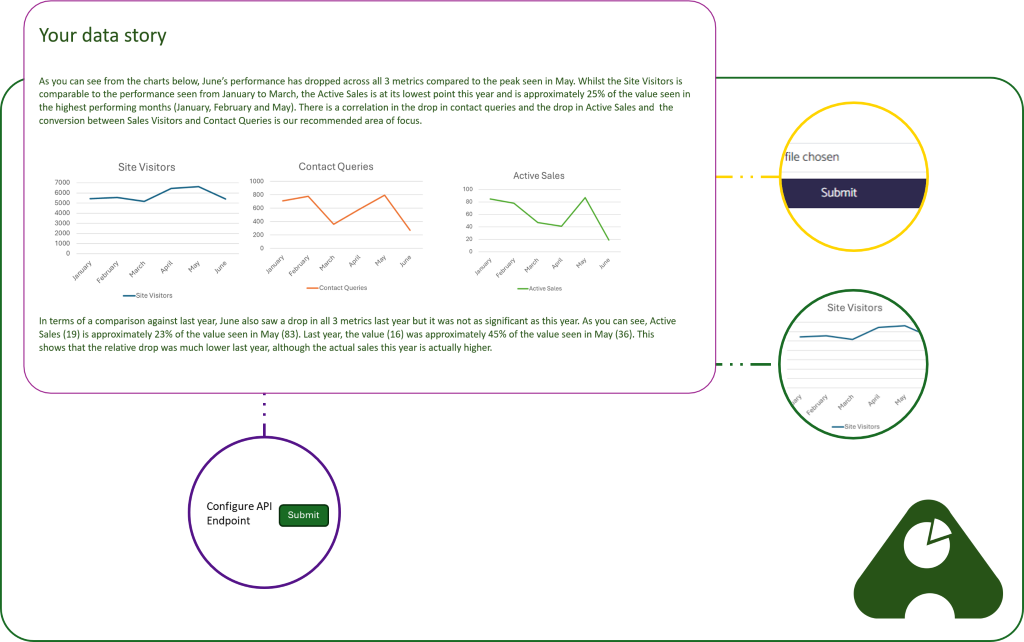
- Automatic data interpretation: Upload any structured data to the platform and Datacase will interpret the data and understand the relationship between your columns/fields.
- Visualisation of data in charts: Datacase automatically creates a series of charts and graphs that visualise your data in an accessible and easy-to-understand format.
- Data storytelling: In addition to the visualisations, Datacase tells the story of your data - finding insights and observations and presenting them to users in natural language.
- Data correlations: Where there are correlations between data points (e.g. a specific sales activity and revenue), Datacase highlights the correlation and provides detail around the trend that has been identified.
- Predictive analytics: Datacase uses correlations, coupled with machine learning and data science, to predict future outputs based on the trends and key performance indicators
- Prescriptive analytics: Receive recommendations on the actions that your business should be taking to maximise successful outputs and drive positive performance
- Fully automate the process: Configure API endpoints to enable the data to be automatically integrated between your data warehouse and Datacase, with advanced scheduling to send the right reports in your chosen format to the correct people at the appropriate time
Get Datacase now
Online:
iOS (via the App Store):
Android (via Google Play Store):
Custom formats for your data stories
- Various output formats: Receive the analysis in your browser, via a scheduled email or download in PDF. Alternatively, the data can be automatically integrated into Powerpoint or Google Slides for easy sharing with your business leaders
- Total control over the insights received: Turn on or off various insights, or only subscribe to receive certain insights at specific times. You can also change the verbosity of insights and the depth of analysis received for each component.
- Fully customisable visuals: Change the colour theme and fonts to match your own brand. Optionally include your organisation's logo on the outputs.
- Position outputs where you want them: Create a template and then use our custom positioning configuration to ensure that every chart and data story is positoined where it should be.
- Create custom visualisations: Take full control over the output format to create bespoke visualisations - medal tables, funnels and step changes are all examples of visualisations that can be created.
- Push notifications into chat: Receive data insights and suggestions in chat interfaces such as Google Chat and Slack to enable your team to make real-time data-led decisions.